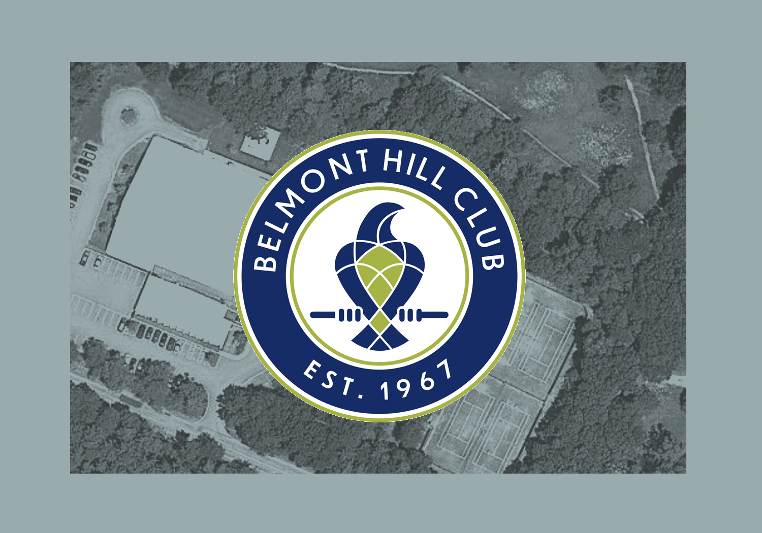
Belmont Hill Club Brand Strategy
Belmont Hill Club (BHC) wanted to steer away from the obvious, literal emblem of tennis racquets crossed, and explore ideas and images that represent the club’s expanding facilities and landscape.
As a club member, the majestic red-tail hawks that circle the club daily became a central theme. Soon a perched hawk, a mascot, emerged in the simple geometric shapes, seamed together to form the hawk, perched scanning the grounds.
A revamped website and online communications followed along with team apparel—winter hats, vests, performance jackets & pullovers, summer caps and visors.


As a club member who loves tennis and community, I was honored to work with the club director and manager to conceptualize a logo to represent the club and its colorful history.

